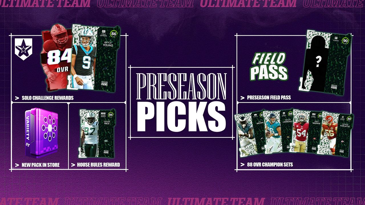
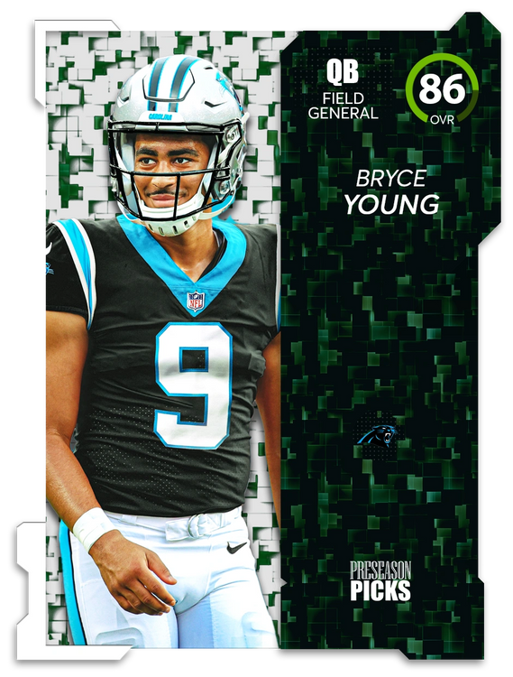
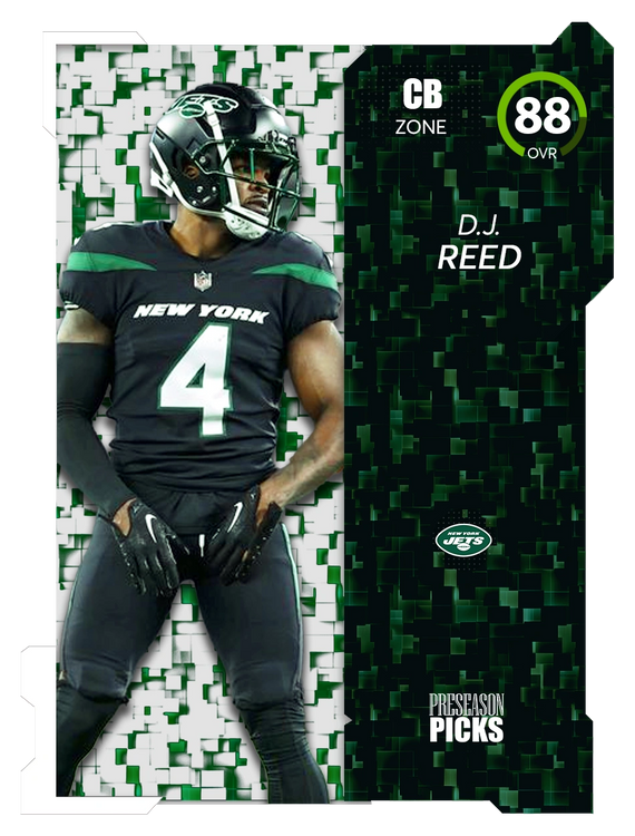
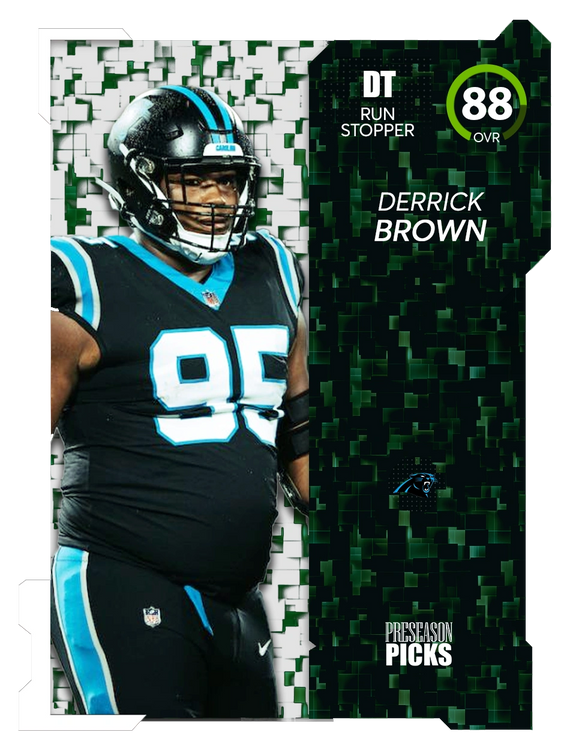
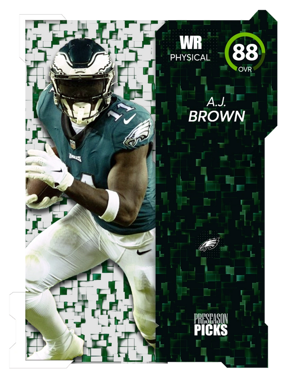
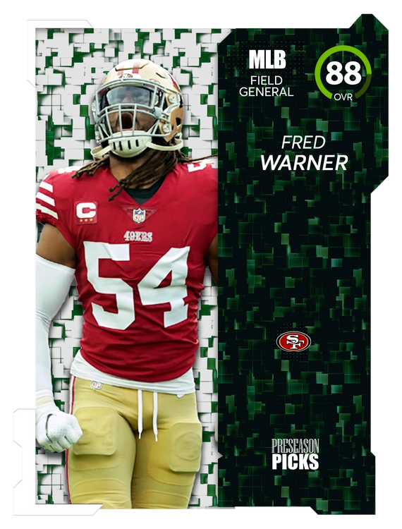
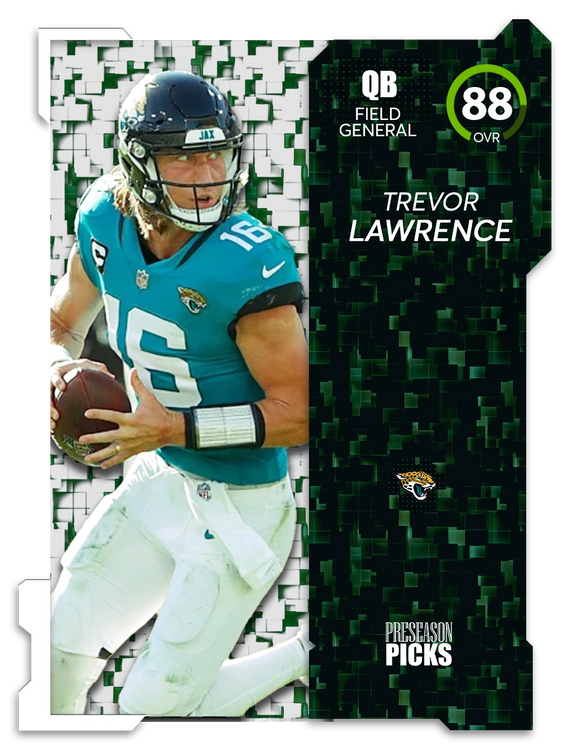
Hey y'all. Yesterday I decided to create a mockup for a MUT 24 program, "Preseason Picks." The premise is having 1 player from each of the teams that are projected to win their division this year, so 8 "Champions" in total. Then I added a few other as House Rules/Solos/Field Pass rewards.
This was a fun project for me to add to my portfolio, but I just found out this site has a graphic design forum, so here I am. Would love to hear what you guys think.
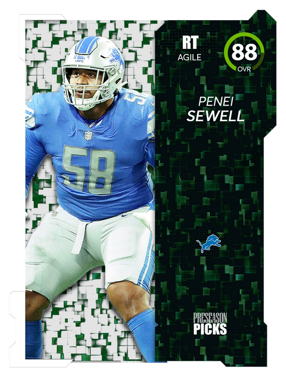
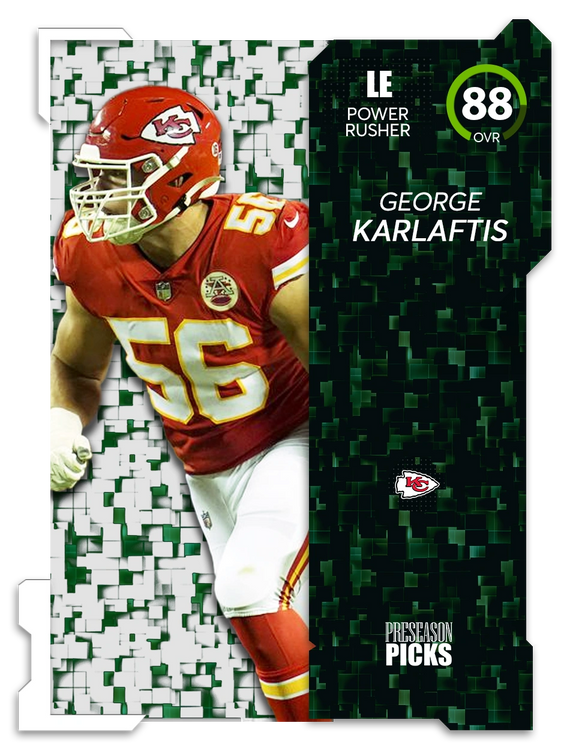
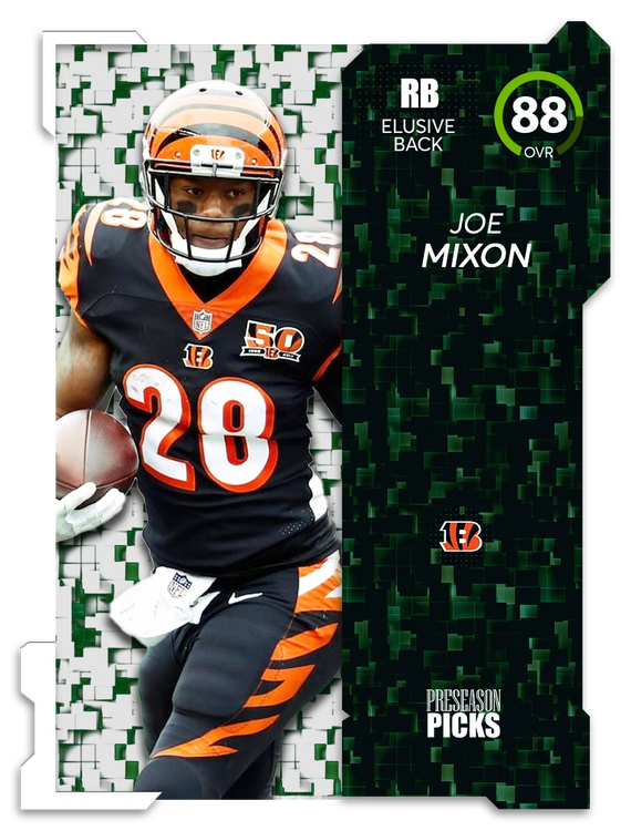
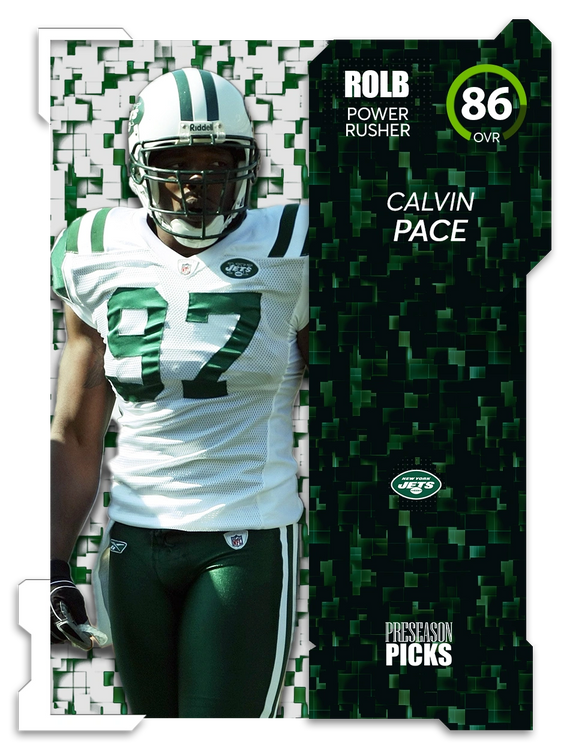
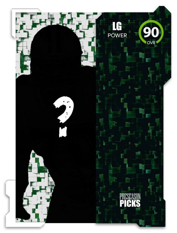
For the last player I thought it would be cool to have the Field Pass reward player a mystery until people get to that level. It would only display the OVR and position. In this case it was Zach Martin that I just made his silhouette black. Obviously, once people would get to that level it would be out in the public, but it would be a cool chase for people to try and get to first.
